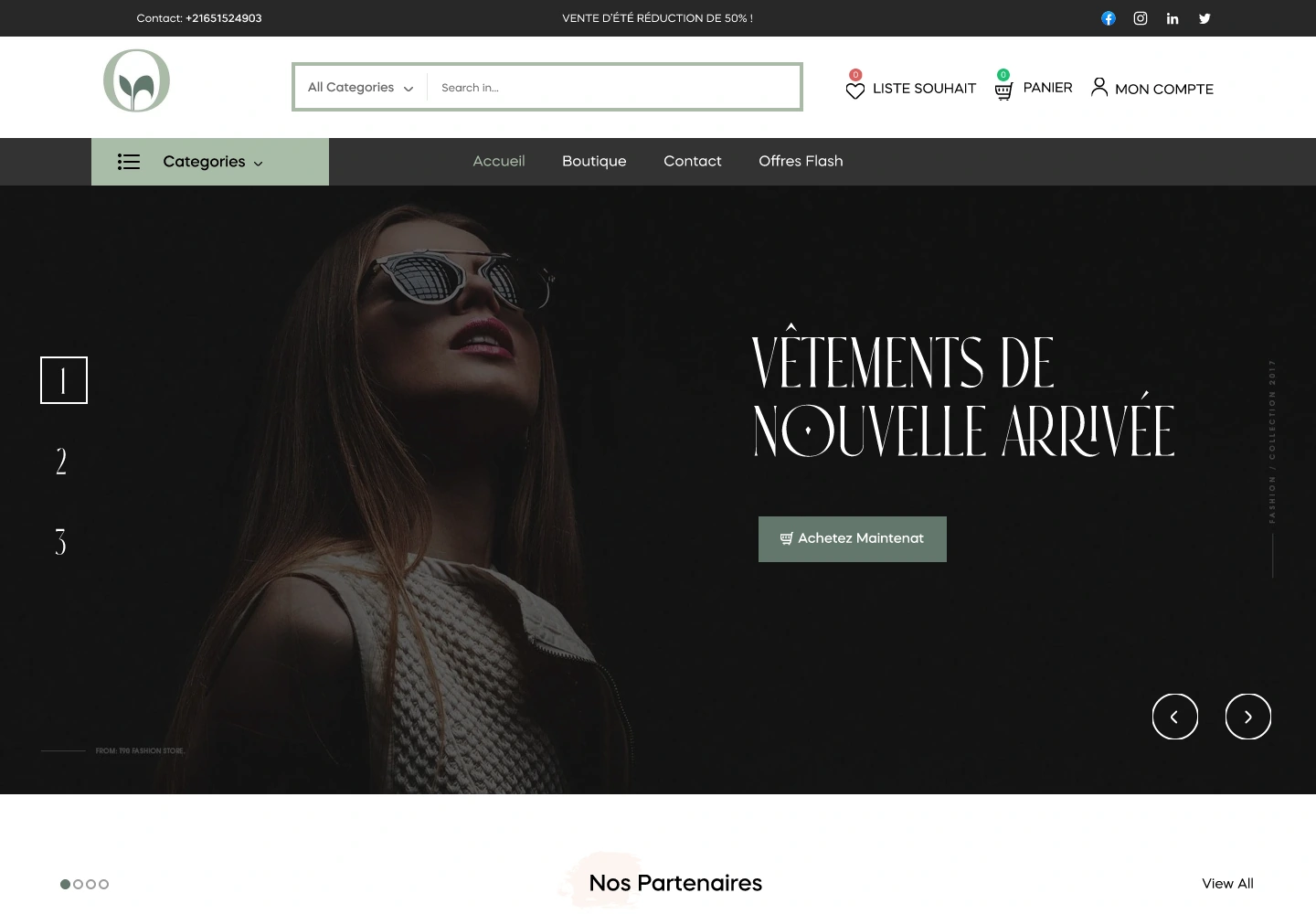
Selection.
Concept StoreA considered storefront, from discovery to checkout.
01 / Overview
A place to discover.
A reason to explore.
A concept store bringing Tunisian brands and well-being products into one shopping experience.
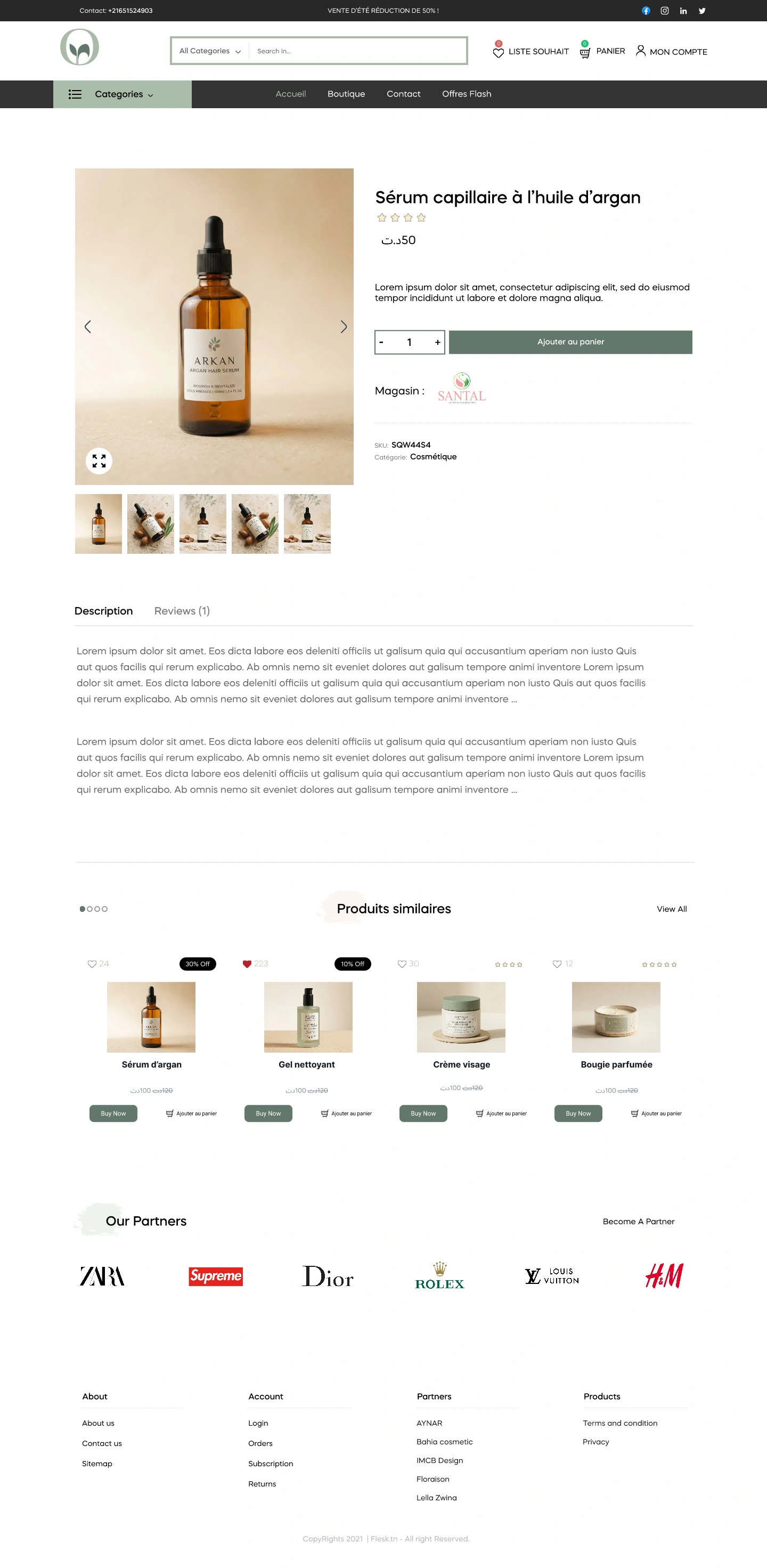
The design connects an editorial storefront with the practical details of shopping: browsing a collection, exploring a product, reading reviews and moving into checkout.
My interface design work brings those moments together across desktop and mobile, using a restrained visual language and a consistent structure for product information.
- My role
- UI design
- Experience
- Responsive storefront
- Project
- 2022
- Focus
- Discovery & checkout
The design direction
Let the collection lead.
Keep the choices clear.
The storefront gives photography and products room to speak. Categories, product information and shopping controls then provide a clear route through the collection.
A consistent direction
Discover.
Use an editorial opening to introduce the collection.
Compare.
Give product information a predictable structure.
Choose.
Keep options and shopping actions easy to find.
Continue.
Carry the same visual language into checkout.
02 / Website experience
An introduction
to the collection.
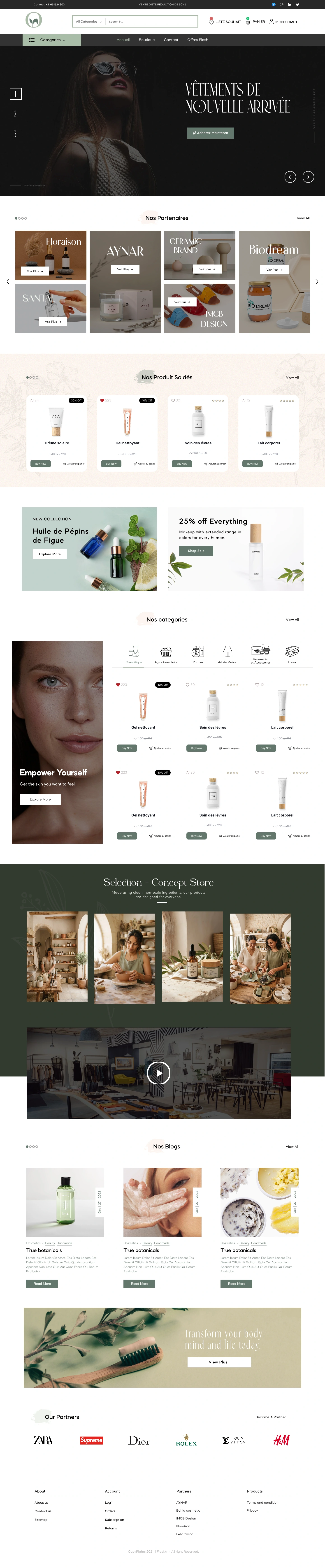
The homepage alternates product discovery, category entry points and editorial content. The long page keeps the store’s character present as visitors move deeper into the selection.
Inside the experience
From browsing
to a considered choice.
Each page answers a different question: what is available, what makes a product relevant, and what needs to happen before an order is placed.
01 / Shop
A collection to explore.
The shop presents products in a consistent grid, with category and filtering controls kept close to the collection.
Desktop / Selected interface design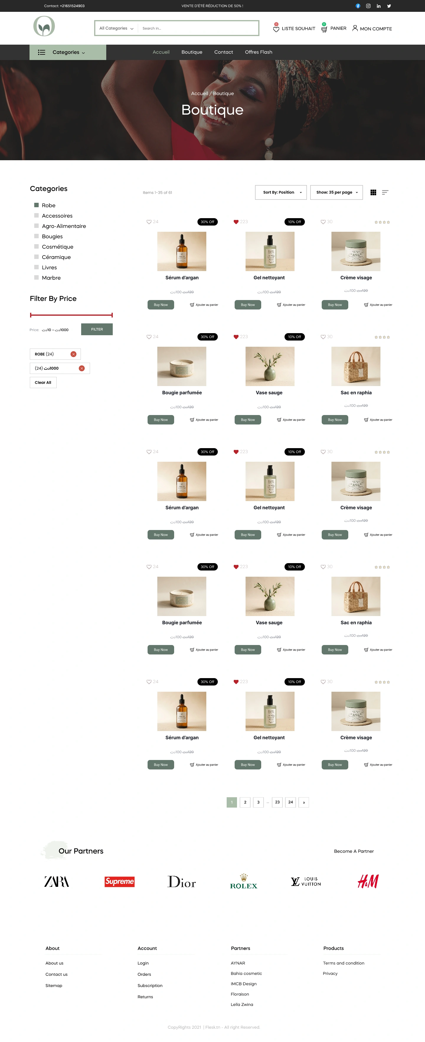
03 / Responsive experience
The same store.
A smaller canvas.
The mobile layouts adapt the collection, filters, product information and checkout to a narrow screen. Scroll inside each preview to explore the full design.

Editorial discovery, adapted for mobile.
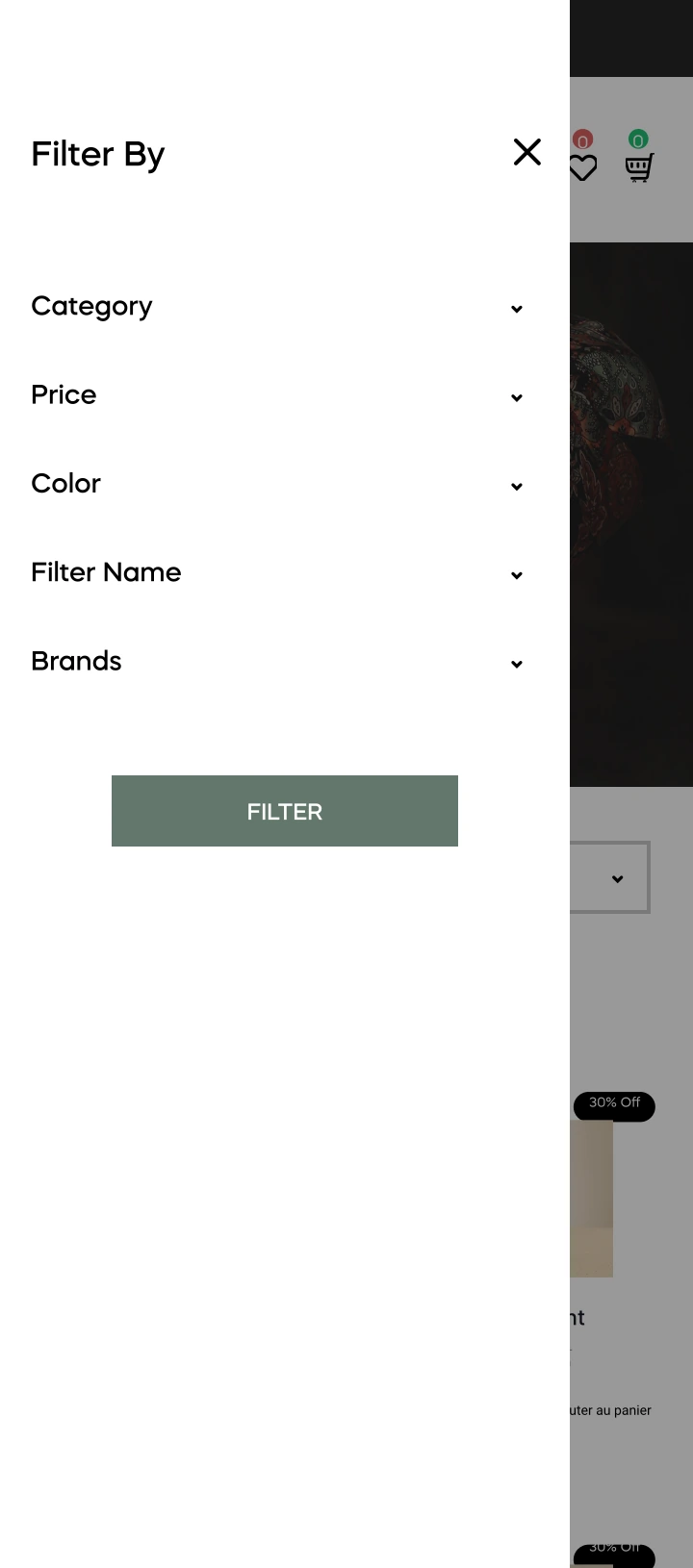
A dedicated space for narrowing the selection.

Photography and information in one vertical flow.

Order details organised for a smaller screen.
The work, together
Character in the details.
Clarity in the journey.
The collection gives the store its personality. A consistent interface connects the steps around it.
From the first impression to checkout, the selected work keeps discovery, product evaluation and shopping details in one visual language.
Next project
Flesk. Back to all work