
Flesk.
Agence digitaleAn agency presence with a clear point of view.
01 / Overview
A distinct voice.
A connected experience.
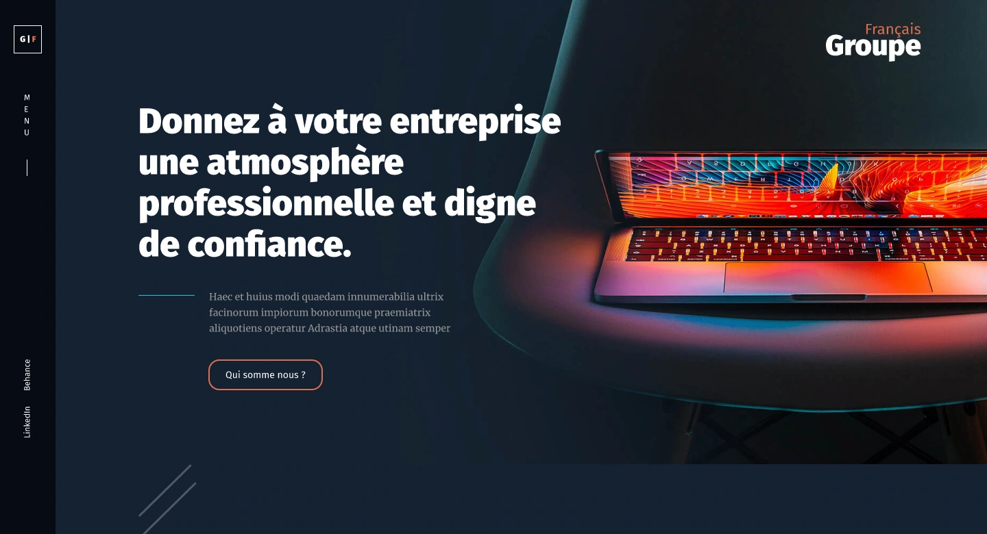
A digital-agency website connecting its positioning, expertise and selected work.
The Flesk design brings strategy, product design and development into one agency presence. Its pages move from an introduction to the team’s offer, then into the work and ways to start a conversation.
My interface design work develops a shared hierarchy across those pages and their mobile layouts. Typography, colour and repeatable patterns give the content a recognisable rhythm.
- My role
- UI design
- Experience
- Agency website
- Project
- 2022
- Focus
- Services & selected work
The design direction
Make the offer clear.
Let the work speak.
An agency website needs to introduce a point of view and help visitors understand what the team can do. The page structure connects that introduction with services, project examples and contact.
A consistent direction
Introduce.
Start with the agency’s point of view.
Explain.
Give each area of expertise a clear place.
Show.
Let selected projects carry the visual story.
Connect.
Make the next conversation easy to begin.
02 / Website experience
A strong opening.
A clear direction.
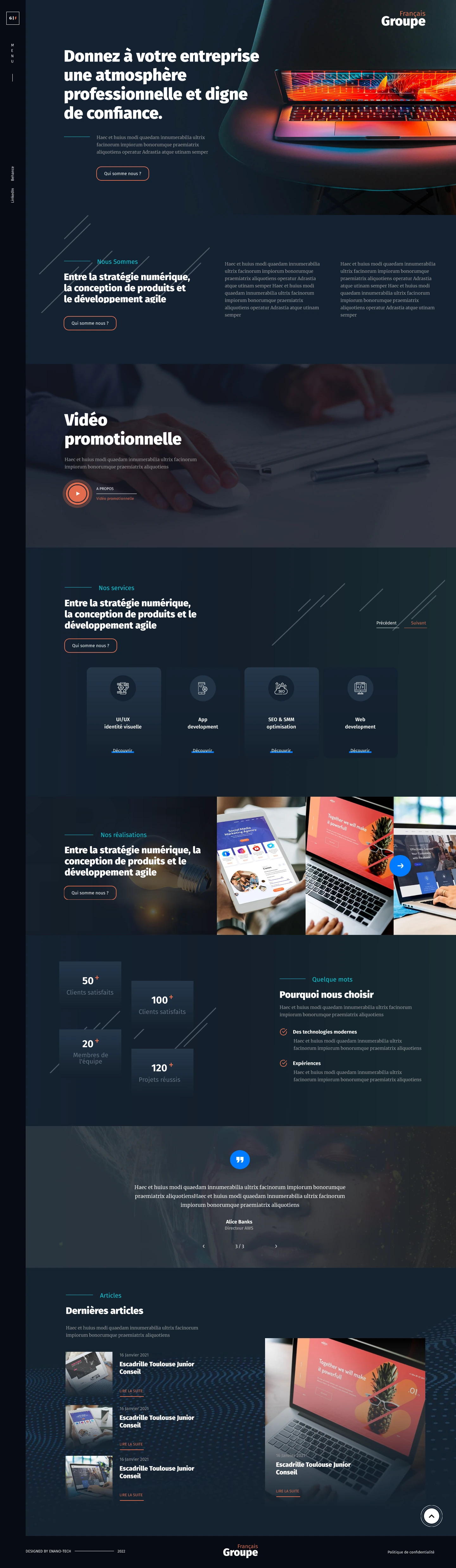
The homepage uses expressive typography, layered content and project imagery to introduce the agency. Services and selected work create a route through the rest of the website.
Inside the experience
One agency.
Several ways in.
About, expertise, work and contact pages share a visual language while giving each kind of information its own structure.
01 / Agency
Introduce the practice.
The agency page develops the introduction through a longer editorial layout, with clear sections and supporting imagery.
Desktop / Selected interface design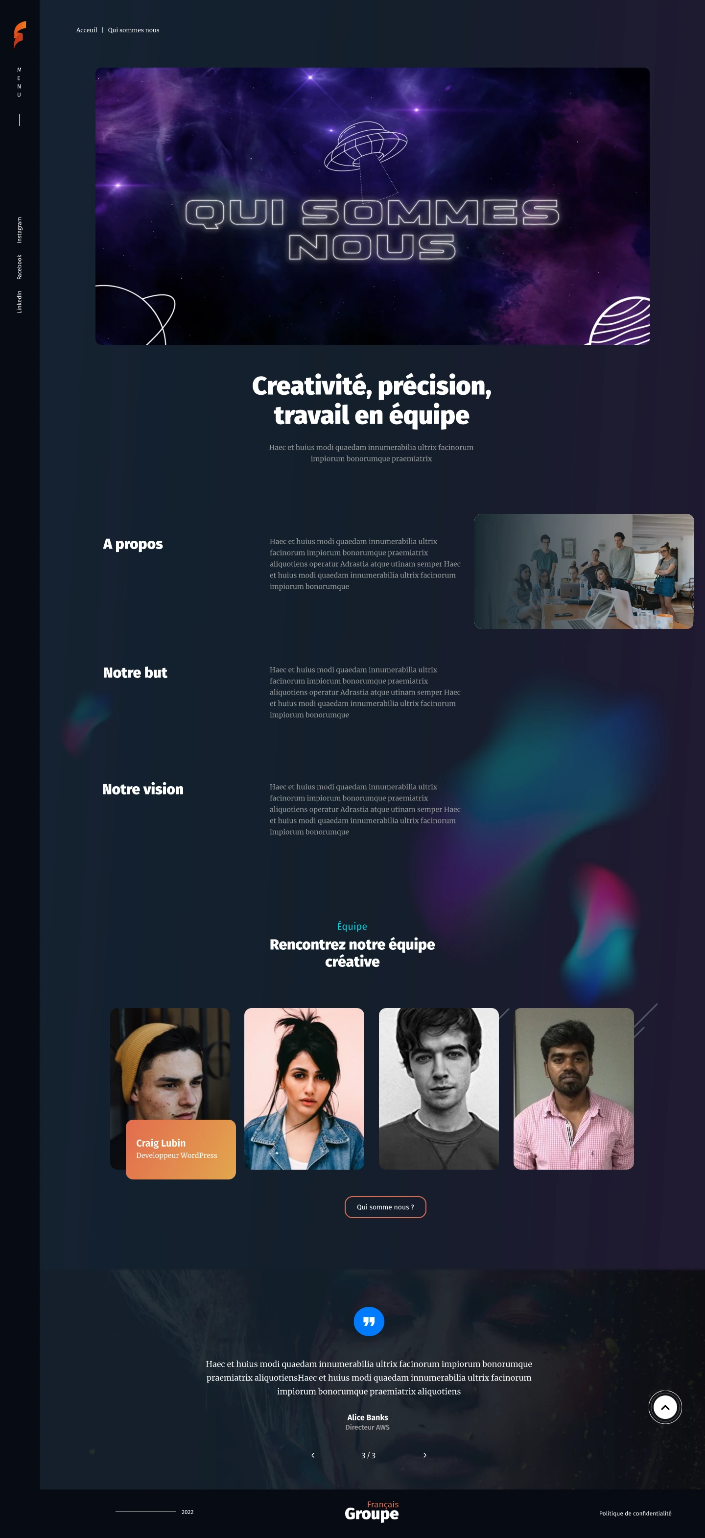
03 / Responsive experience
A clear voice.
At every size.
The mobile layouts carry the agency’s typography and content hierarchy into a vertical reading experience. Scroll inside each preview to explore the full page.

The agency introduction and selected content.

A longer editorial story on a narrow screen.
04 / Visual foundations
The identity,
across touchpoints.
Colour and typography give the agency a shared visual language across website pages, responsive layouts and social cover artwork.
The work, together
A recognisable rhythm.
From page to page.
The website, responsive layouts and visual foundations work as parts of the same agency presence.
The selected work connects an expressive first impression with service information, project presentation and the next point of contact.
Next project
Quicktext. Back to all work