My Easy
Transfer.
Everyday support.Across borders.
One experience, from the first visit to the next transaction.
01 / Overview
Closer to home.
Clearer on screen.
Money transfers, mobile top-ups and everyday services for people supporting their loved ones from Europe.
My Easy Transfer is a fintech platform bringing international transfers, mobile top-ups and bill payments together. It serves diaspora communities connecting Europe with North and West Africa.
The selected design work spans the public website, the account workspace and the mobile app. The focus is on making service choices, recipient details and transaction steps clear across those touchpoints.
- My role
- UX/UI design
- Touchpoints
- Website & web app
Mobile experience - Design focus
- Service selection
Transaction flows - Industry
- Fintech
Cross-border services
The design focus
Make each step
easy to understand.
A cross-border service asks people to make several decisions: what they want to do, who they are supporting, the amount involved and how to complete the transaction.
The interface brings those decisions into a consistent structure, with clear service entry points, distinct steps and a summary that stays close to the task.
A consistent direction
Orient.
Give each service a clear place to begin.
Separate.
Let each step answer a distinct question.
Summarise.
Keep key transaction details in view.
Continue.
Make activity and confirmation easy to return to.
02 / Web experience
From understanding
to taking action.
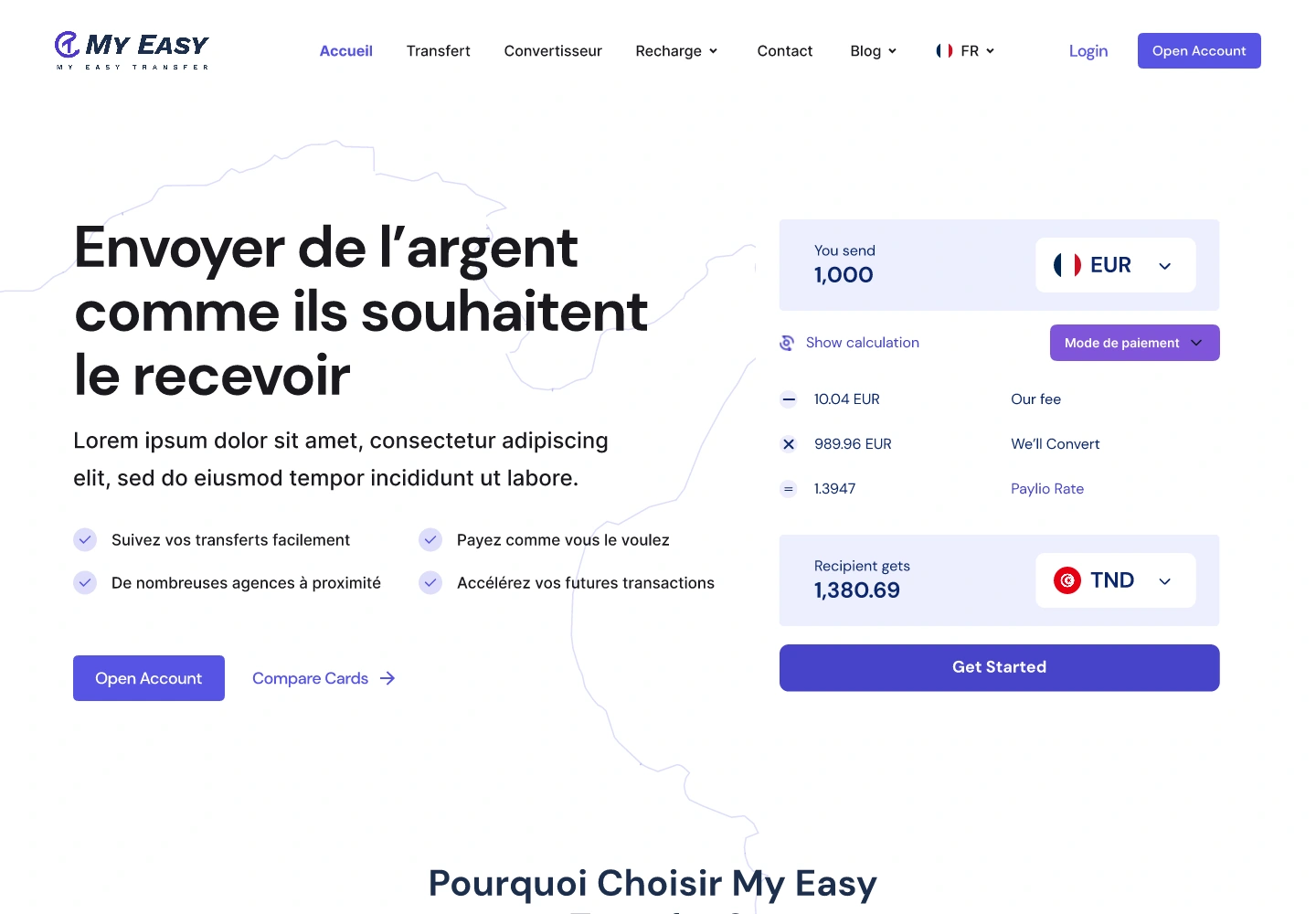
The website introduces the service, brings the transfer calculator into the first view and gives people a route into the experience.

Help visitors understand the ways they can support someone.
Give the amount and destination a clear starting point.
Carry the visual language into the account experience.
The account workspace
A familiar place
for everyday actions.
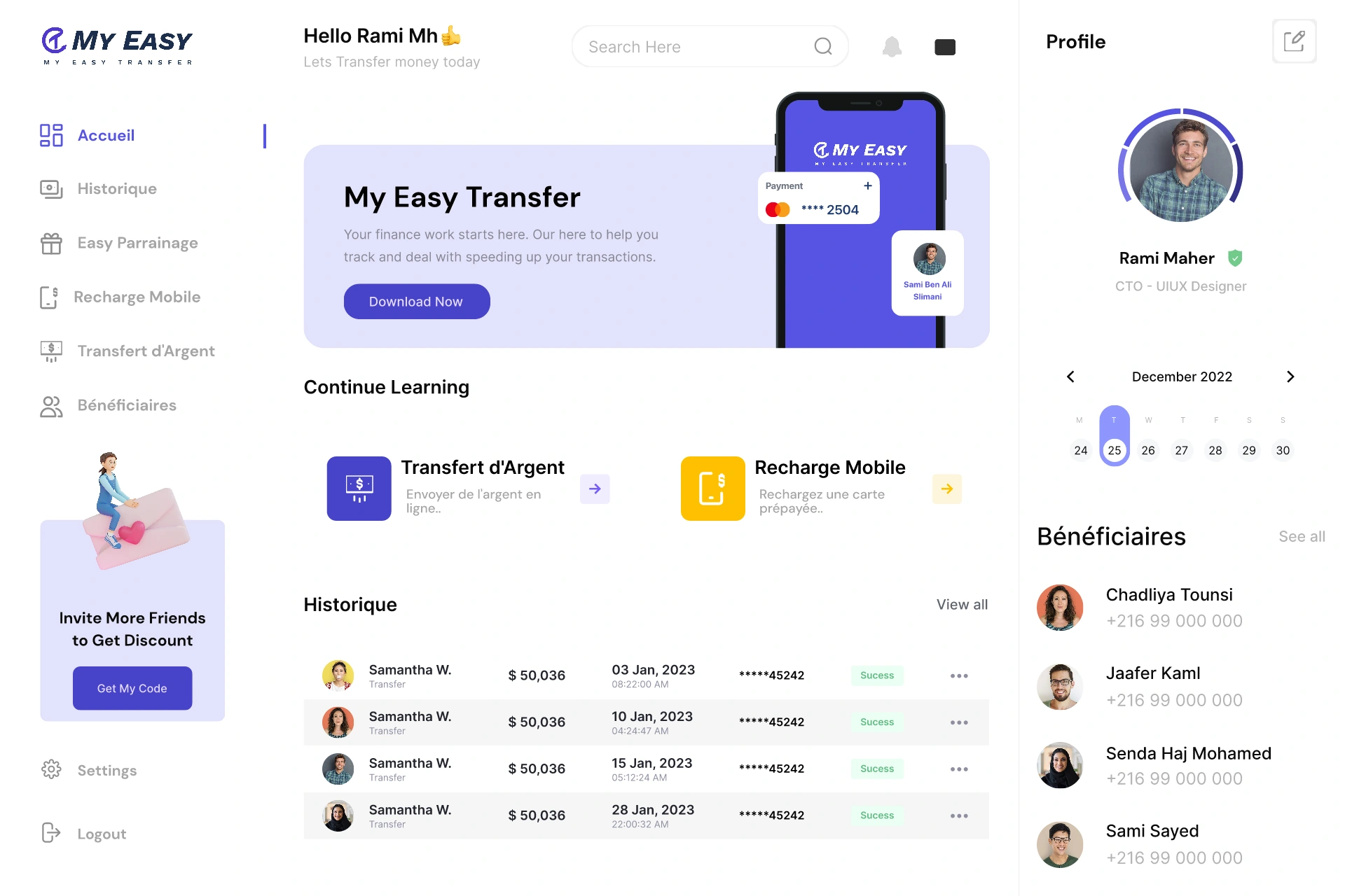
A dashboard, service flows and a transaction history share the same navigation and visual structure.
01 / Dashboard
An everyday starting point.
The account overview brings the main services and recent activity into the first view. Clear shortcuts help users return to the task they came to complete.
Web application / Interface designInside the transfer
A clear sequence.
A visible summary.
Amount, recipient and payment are treated as distinct decisions. The screen structure keeps the transaction’s context alongside them.
Bring the values and delivery options into a structured starting point.
Make choosing who receives the transfer a distinct step.
Keep the transaction summary close to the payment choices.
03 / Mobile experience
The everyday task.
Within reach.
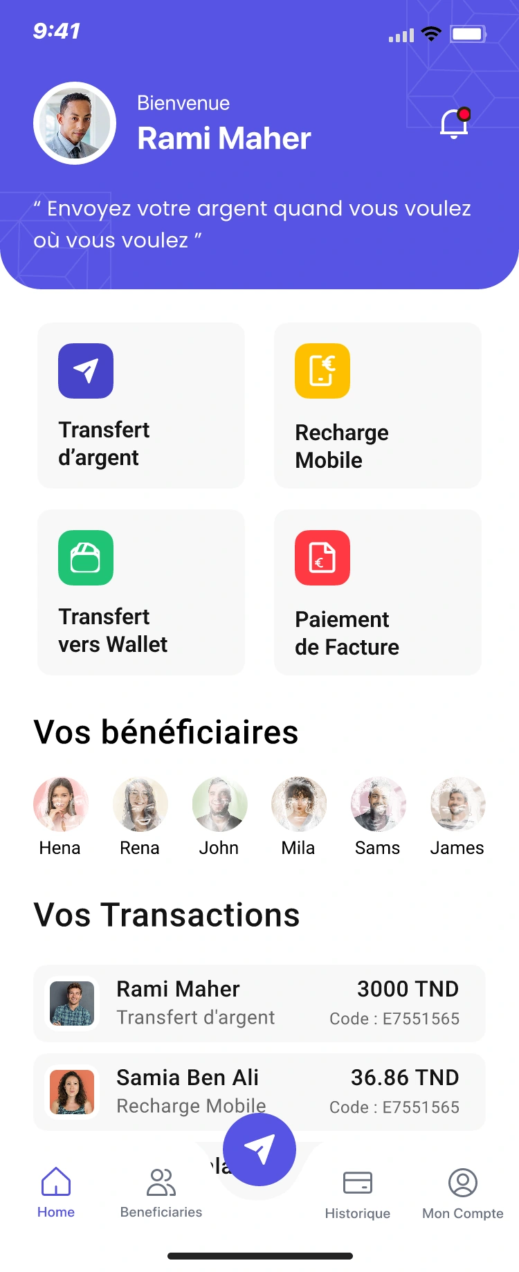
The mobile experience brings the main services, transfer steps and confirmation into a focused sequence.
Services and activity, together.
A focused start to the transfer.
Make the person easy to identify.
Close the action with a clear result.
After the action
Keep the record
easy to return to.
The experience continues with a confirmation, an email and a record in the account history. These touchpoints carry the same attention to hierarchy and detail.
The transactional email extends the product’s visual language beyond the app.
04 / Visual language
One recognisable
experience.
Colour, typography and a shared visual identity connect the website, the account screens and the messages that follow.
The work, together
Design for the task.
Stay close to the person.
The common thread is clarity: where to begin, what information matters and what happens next.
Across the website, web app and mobile experience, the work connects service discovery with the details of completing an everyday action.
Explore the live serviceNext project
Haseb. Back to all work